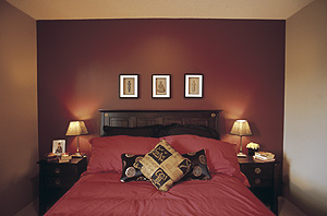
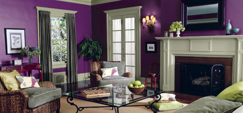
How a color is perceived is affected by a number of factors, but when it's on interior walls, the two most common factors are light and sheen.
 The impact of sunlight
"Sunlight is the purest light and provides the purest color from the spectrum standpoint of the perception of color," explains Debbie Zimmer, paint and color expert with the Rohm and Haas Paint Quality Institute. But sunlight changes over time. As the day progresses and the earth rotates, the intensity of the light changes and you'll observe changes in the appearance of color.
The way sunlight varies through the day is pretty obvious. Photographers are very aware of this and often seek to take their photos during certain parts of the day to make best use of these effects. The same applies to paint color. "What may look great at 7 a.m. may look different at 4 p.m.," Zimmer says. "It's related to the intensity of the sunshine and the shadowing."
In the morning, sunlight is warmer because it's lower on the horizon. It will give a yellowish cast to your space, but, because of the imparted extra warmth, color is often its most beautiful in the morning.
As the day progresses to midday, sunlight develops a cool, bluish cast. Ron Saylor, president of Saylor Painting Co. in Eugene, Ore., observes that it is an "interesting paradox that the physically hottest sunlight imparts the least 'warmth' to color. The hottest color temperature (measured in Kelvin units) is blue — off the top end of the visible scale to ultraviolet — and the coolest is red — off the low end to infrared." At midday, especially in areas that receive direct sunlight, color can appear washed out.
As the afternoon wears on towards sunset, daylight again warms with a reddish cast.
"Homeowners and painting contractors experience this every day, but it doesn't become a top-of-mind topic until you're painting," Zimmer reports. There are seasonal changes that affect sunlight, too. "Winter sunlight is a bit more on the cooler, blue side than summer sunlight," Zimmer says.
Artificial light's effects
In residential and commercial spaces, artificial lighting is frequently used to either supplement daylight or replace it entirely. The type of artificial lighting used plays a large role in how a color looks.
In residential and commercial spaces, artificial lighting is frequently used to either supplement daylight or replace it entirely. The type of artificial lighting used plays a large role in how a color looks.
The kinds of typical artificial lighting most commonly used in residential and commercial spaces include incandescent, fluorescent and halogen. Zimmer says the effects of these artificial lighting sources can make certain color choices winners or losers.
"Incandescent and halogen lighting tends to warm up reds and yellows because the wavelengths of these artificial lights are warm," Zimmer explains. So, if you have incandescent light and you want blue walls, you might have to make adjustments, such as selecting a value that is a blue toned with red.
Fluorescent light, on the other hand, is very cool lighting. "It tends to enhance blues and greens, so, a blue or green paint will appear better with fluorescent lighting," explains Zimmer.
But beware, she warns. Too much of something is not always best. For example, she says, a lot of people have fluorescent lighting in their bathrooms. In that situation, painting the bathroom green might not be the wisest choice, because you'll get a double dose of a green cast when you look at yourself in the mirror.
If the question "How is this room going to be lit?" doesn't get asked, you're asking for trouble, says Saylor. On one job he was matching the finish of a new dining room buffet with existing furniture. "In my shop we use lighting that most closely matches natural daylight. But my client's dining room had a bronze-tone glass ceiling that flooded the room with an amber glow. I had to make my color samples with that in mind for them to work." That same question — "How is this room going to be lit? — is just as important when your client is choosing paint colors for the walls and ceiling, he says.
 Shadow effects
When you remove light — or tone it down — there is a different effect on the perception of color.
In areas where there is shadow, "color would never look bright or vibrant, because the color of the paint never has a chance to jump out," explains Chris Ormsby, production coordinator at Catchlight Inc., Fine Residential Painting. Light waves can't play off the pigments in the paint, he says. But there may be times when this is an important consideration, he adds. "In a softer-lit area you may be able to see the color better than in a stronger-lit area."
Shadows can be a challenge. Saylor recalls painting a large living room with a small nook that didn't receive the same amount of light. "The homeowner said we painted the nook the wrong color because it didn't look the same."
In situations like this, Saylor says, the contrast can be quite dramatic, and the client was adamant that he used different colors of paint. "I wound up taking a brush-full of paint and putting a splotch on the living room wall and another splotch on a wall in the nook. I told the homeowner if the colors weren't the same in the morning the job was free. That night, under artificial light, when the effects of natural daylight through the window were removed, he could see that the color was, indeed, the same on both walls." Saylor received an apology.
Combinations at play
In the real world, there isn't just one kind of light at play — you typically have a combination. If there are large windows, it likely will be a combination of a lot of daylight, some artificial light and some shadows. With small windows, you may have the effects of only a little daylight, primarily artificial light and some shadows. But there's more to consider! You may have a southern exposure, with more direct daylight effects; a northern exposure, with mostly indirect daylight; an eastern exposure, with a lot of morning sun; or a western exposure, with mostly afternoon sun. Northern and western exposures provide cooler, bluish tones. Southern and eastern exposures are warmer, more yellow.
In the real world, there isn't just one kind of light at play — you typically have a combination. If there are large windows, it likely will be a combination of a lot of daylight, some artificial light and some shadows. With small windows, you may have the effects of only a little daylight, primarily artificial light and some shadows. But there's more to consider! You may have a southern exposure, with more direct daylight effects; a northern exposure, with mostly indirect daylight; an eastern exposure, with a lot of morning sun; or a western exposure, with mostly afternoon sun. Northern and western exposures provide cooler, bluish tones. Southern and eastern exposures are warmer, more yellow.
And today's bright sunny sky may be overcast by clouds tomorrow.
Then there are other elements that can affect the perception of color, reflecting additional color tones. For example, the predominant color of something right outside of a large window, say green shrubs or trees. More often than not, it is something right inside the room.
"What affects interior colors most is the color of your floor," Ormsby says. "For example, a red oak floor in full sunlight will throw off a red cast to the walls." The larger the reflective surface, he says, the more effect it will have. That applies to large pieces of furniture, area rugs and drapes, too, to name a few.
Adding gloss to the mix Flat, eggshell, satin, semi-gloss and gloss. Often the choice in sheen has to do with durability and hiding power, but it also affects the perception of color.
From manufacturer to manufacturer, there may be some overlap in what gloss level a paint is rated. This is because gloss level is measured and defined within a range. For example, a flat paint may fall within a reading of 0 to 10, while a satin can range between a 5 and 25 reading. So, one manufacturer's eggshell can be another's satin. As a rule, higher gloss paints tend to look brighter. Much like wetting something with water, a high-gloss sheen enriches color, Ormsby says. "Gloss often enhances and creates more body and richness to a color. If you have a duller sheen, the color is flatter," he observes. However, this isn't always the effect you want on walls, he says.
With high sheen you may have problems with glare, the result of harsh lighting.
"If you have a sheen that's reflecting light, it's not always as decorative or pleasing. On the other hand, with a flat sheen you don't get the exaggeration you might experience with a gloss," Ormsby points out. "From a decorative standpoint, duller sheens are preferable on some surfaces, such as walls. In a living room you don't necessarily want to draw your eyes to the wall. But high gloss might be the choice for items you want to stand out, such as a mantelpiece."
 Putting it all together
Putting it all together is where it can get complicated, Saylor says. There really is a lot at play. "A color may be modified by the quality of the light source (red light of a sunset); modified by light reflected from colored surfaces (light flooding a room reflected off of green trees and a lawn); modified by shadows in the surface texture (heavily textured white wall grayed by the shadows cast by the texture profile); and further modified by comparison with other colors in the same view (a red object being 'set off' or intensified by a green background)."
A little discussion up front can really help. Ormsby reports, "I cover the effects of lighting and sheen, and people are receptive to the idea that light changes — they think of their house now as a fluid palette — and think of that when they're making their color choices."
One technique that can help your clients understand the effects of light and sheen on their paint choice is to have them view the paint chip at the paint store in a variety of light types — full spectrum to mimic daylight, incandescent and fluorescent.
Both Ormsby and Saylor recommend using color samples that people can move around the room.
"We always show large samples," Saylor says, "nothing smaller than an 8-inch-by-10-inch drawdown card." He applies a uniform coat of paint in the same sheen that is specified for the job. "I supply at least two drawdowns for each color, so the client can hold them up to inside corners," where you can often get the idea that the colors are all wrong.
Sometimes you have to get creative, Saylor says. "We've stapled white plastic over a natural wood ceiling to simulate a painted white ceiling."
When selecting a paint color and decorating a space, "it's all about balancing the type of lighting, gloss level and the impact of other colors in the space," Zimmer says. "Some things are controllable and others are not, but it's a matter of creating harmony with these three factors."
It's also important to use the language of color properly and carefully when talking with your clients. "The terms in conventional usage are interchanged for different meanings and it is confusing," Saylor observes. "It becomes hard to communicate when people talk about shades and tints when they mean hues."